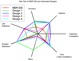
Star plots allow one to view multiple variables in a clear form. The plot above is showing MER IDD and automated designs.
Thursday, April 17, 2014
Similarity matrix

Similarity matrix shows similarities between a set of data points. Above shows distances between 13 different locations on the Isle of Wight
Correlation matrix
 http://www.biomedcentral.com/1471-2164/8/353/figure/F5?highres=y
A correlation matrix will show the correlation between multiple variables.
Stem and leaf plot

Stem and leaf plots show the frequency as which a variable occurs. The steam and leaf plot above is a basic exams of what a complex plot wold look like.
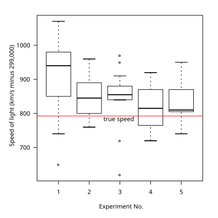
Box plot
 http://upload.wikimedia.org/wikipedia/commons/f/fa/Michelsonmorley-boxplot.svg
Box plots depict groups of numerical data with each box representing he parameter of the data set the extending lines from the boxes are whiskers that show the variation from the upper and lower limits if the box. Box plots are non-parametric. The plot above is showing measurement of the speed of light.
Histogram
 http://upload.wikimedia.org/wikipedia/commons/c/c3/Histogram_of_arrivals_per_minute.svg
A histogram is a graphical display of the distribution of data in bar form. This histogram shoes the frequency of arrivals per minute.
Parallel coordinate graph
Parallel coordinate graphs are created to display large amounts of information. They are not mainly used to indicate change, but to express large amounts of data. Each variable is graphed on the vertical axis. Age, Number of years of study, Race, Sex, Hours-per-week are the variables being measured in trying to determine the influence of the revenue of the individuals.
Triangular plot
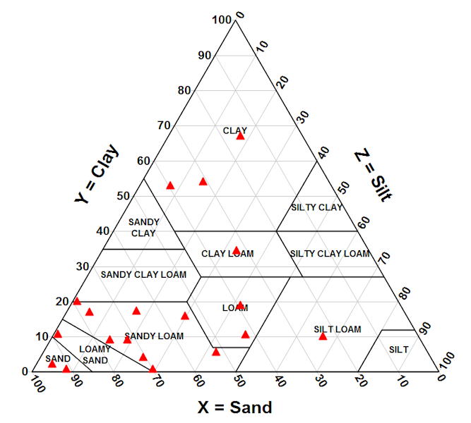
A triangle plot shows three different variables. It is mainly used to show relative soil composition like the one above.
Windrose
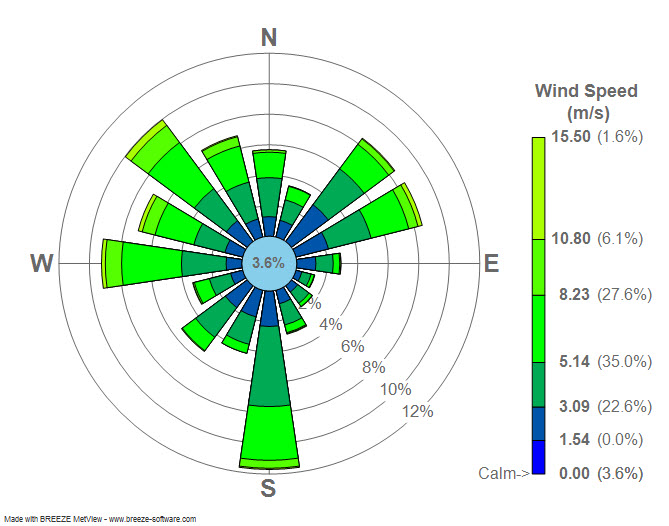 http://upload.wikimedia.org/wikipedia/commons/7/70/Wind_rose_plot.jpg
A wind rose is generally used by meteorologists to view how wind speed and direction a distributed within an area. The wind plot above is of La Guardia Airport in New York, New York.
Climograph
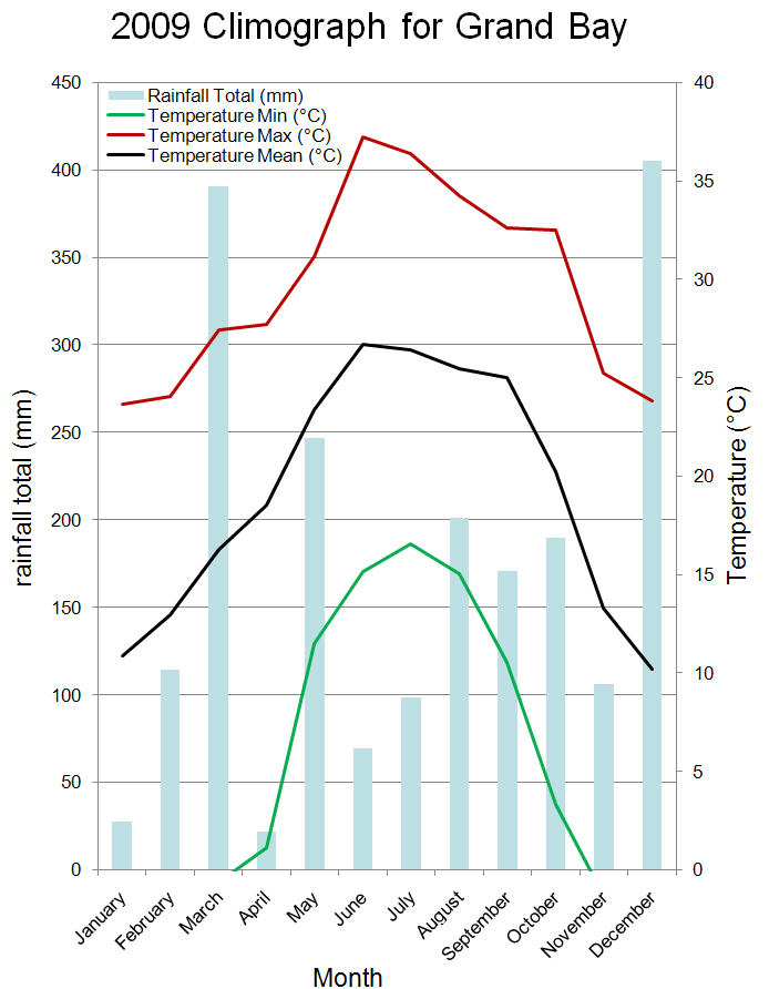
A climograph depicts rainfall totals and temperature of an area for each month. The one above is about the Grand Bay.
Population profile
 http://www.fdbetancor.com/wp-content/uploads/2012/06/USA_population-pyramid_2010-to-2050.png
A population profile show age and sex distribution of an area. The population profile or pyramid above is of the United States in 2010 and an estimated pyramid on what the population distribution will be in 2050 showing the population will move from a slightly contracting pyramid to stationary.
Scatterplot
 http://oklo.org/2011/02/
A scatter plot is a graph of plotted data points. Based on the orientation of the dots (the closure together dots are the general average where as the farther spaced ones are not as of accurate of points that can be known as outliers) one can get a general trend of what has been plotted. Many of the scatter plots add a trend line to depict the average trend. The graph above is plotting planetary effective temperature vs planetary radius.
Dot distribution map

A dot distribution map ause dots to represent the quantity or value of something. The map above shows density of population and is being used to help show the urban heat island warming effect.
Accumulative line graph/Lorenz curve

A Lorenz Curve (or accumulative line graph) compares
the distribution of two variables against each other. This determine
whether the distribution is equal or unequal. Unequal distributions will result in two lines, whereas equal distribution will result in
one line.

Nominal area choropleth map
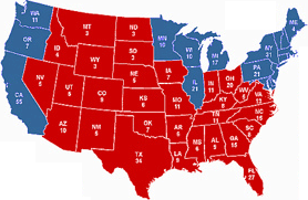
Nominal area choropleth maps use nominal data to show measurable differences across an area. This map represents the 2008 election results.
Unstandardized choropleth map

Unstandardized choropleth maps show projections using raw data where it is not been averaged. This map shows the number of
hazardous waste site installations per state in 1997 and is broken down into six intervals.
Standardized choropleth map

Standardized choropleth maps are areally averaged data. This map shows the global population density. Areally averaged data can be showen as a percentage or density like above.
Univariate choropleth map
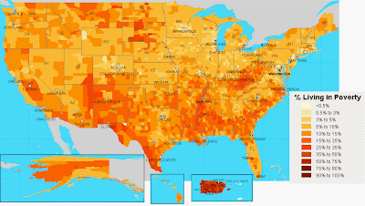
Univariate choropleth maps show shows one set of data, like above in showing percent living in poverty in the United States.
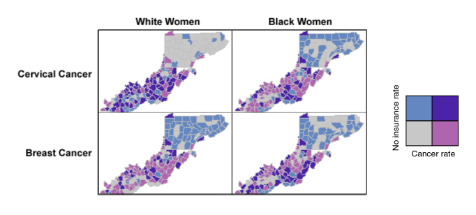
Bivariate choropleth map
 https://www.e-education.psu.edu/geog486/book/export/html/1800
Bivariate choropleth maps show two sets of data, unlike the univariate that only shows one type. Above the map shows cancer within white and black women and how it compares.
Flow map

Flow maps show the movement of something from one area to another. The map above shows the movement of heatflow within the United States.
Unclassed choropleth map

Unclassed choropleth maps show data in color shadings that are proportional to the data size.For example, with the map above the more acres of land with vegetables harvested for sale the bigger area and darker the color used to denote that.
DOQQ

Digital Orthoimagery Quarter Quadrangles are aerial photographs where
distortion caused by normal aerial photographs, like relief
displacement and camera angle, are removed.
This allows the image to be used as a reliable map for calculating
different things like distance and angles.


DRG
Digital Raster Graphics are scanned images of U.S. Geological Survey topographic maps. These maps usually contain the original "map collar" or border. This is a DRG of an area in Texas.

Isopleths

Isopleths display lines connecting points that have equal frequency of a specific meteorological feature. This map above is showing the annual precipitation of this area on June 10, 2000.
Isopach

Isopachs are lines connecting points of equal thickness of stratum (in the atmosphere or within rock). This map is showing thickness of rock of the Weir-Pittsburg coal.
Isohyets

Isohyets are lines that connect points of equal rainfall within a given period. This map shoes the annual rainfall of the county of Santa Barbara. The darker the shade of blue the more precipitation the area received.
Isotachs
Isotachs are lines of connecting points of equal wind speeds.The map above is a jet streak that extends from Kansas into the Great Lakes.

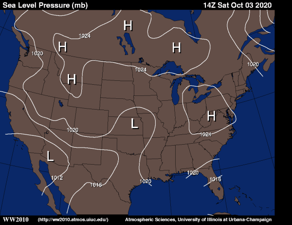
Isobars

An isobar is a line of constant pressure. Om this map it is showing varying pressure across the USA.
LIDAR
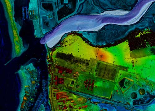
Is a form of remote sensing to examine surface of the earth. LIDAR stands for light detection and ranging. Data is typically gathered by air.
Doppler radar

Doppler radar displays the measurements it has received. It depicts the intensity, direction and movement of different types of weather like rain, sleet, hail.
Black & white arial photo
")
Black and white aerial photography gathers data in the visible spectrum instead of infrared. In this part of the electromagnetic spectrum, black and white color values are exactly what can be seen in the visible spectrum. This type of aerial imagery allows us to analyze large areas of developed or undeveloped land in different spatial resolutions. This black and white aerial of lakes within Africa.
Infrared arial photo

These maps are good for displaying the health of local vegetation and aquatic bodies. Anything with heat variations can be displayed with these types of photos.

Statistical map

Statistical maps show a form of data. This is a map of Australia accessibility remoteness index.
Cartogram
Cartograms display of statistical information in diagrammatic form. It uses a thematic variable which is substituted for land area. The map is distorted to convey the information of this alternate variable. This map displays the worlds population. 
Isoline map
 http://geography.usgs.gov/ctm.html
These maps show continuous lines joining points of the same value. Isolines maps mainly used in the for meteorological purposes.
Proportional circle map
 http://propagandica.files.wordpress.com/2008/11/circlesizeisproportionaltotheamounteachcountysleadingcandidateisahead.jpg
Proportional dot map shows data on a map in proportion to its size. The larger the circle the larger the number. This map is showing the Obama McCain election.
Choropleth map

http://www.grida.no/graphicslib/detail/agriculture-in-africa-value-added-out-of-gdp_10e3#
Standardized chloropleth maps calculate the population per square mile to compare distribution of the population. The different color shades show the relative population distribution in Africa.
Dot distribution map
 http://www.nrcs.usda.gov/Internet/FSE_MEDIA/nrcs143_011108.gif
Dot distribution maps are used to help demonstrate density of the plotted data. The closure the data points indicate higher density in comparison to farther a part dots. This map demonstrates the amount of non-federal wetlands.
Propaganda map
http://longgame.org/2009/11/geopolitics-and-realpolitik-a-layman’s-view/
Propaganda maps alter maps to express personal view on different areas. By inserting text or altering the true scale of regions help express one's opinion. This map presents Ronald Reagan's view of the world.

Propaganda maps alter maps to express personal view on different areas. By inserting text or altering the true scale of regions help express one's opinion. This map presents Ronald Reagan's view of the world.
Hypsometric map
Hyposmetric maps show elevation change through color variation. This map below displays the topography of Africa. Each color is associated with a range of elevations the green being low lying and red being of highest elevation.

Cadastral map
 http://www.spaceage.co.in/cadastral-surveys.php
Cad astral maps show land boundaries and ownership. These maps main use now are for protecting land rights.
PLSS map

Topographic map
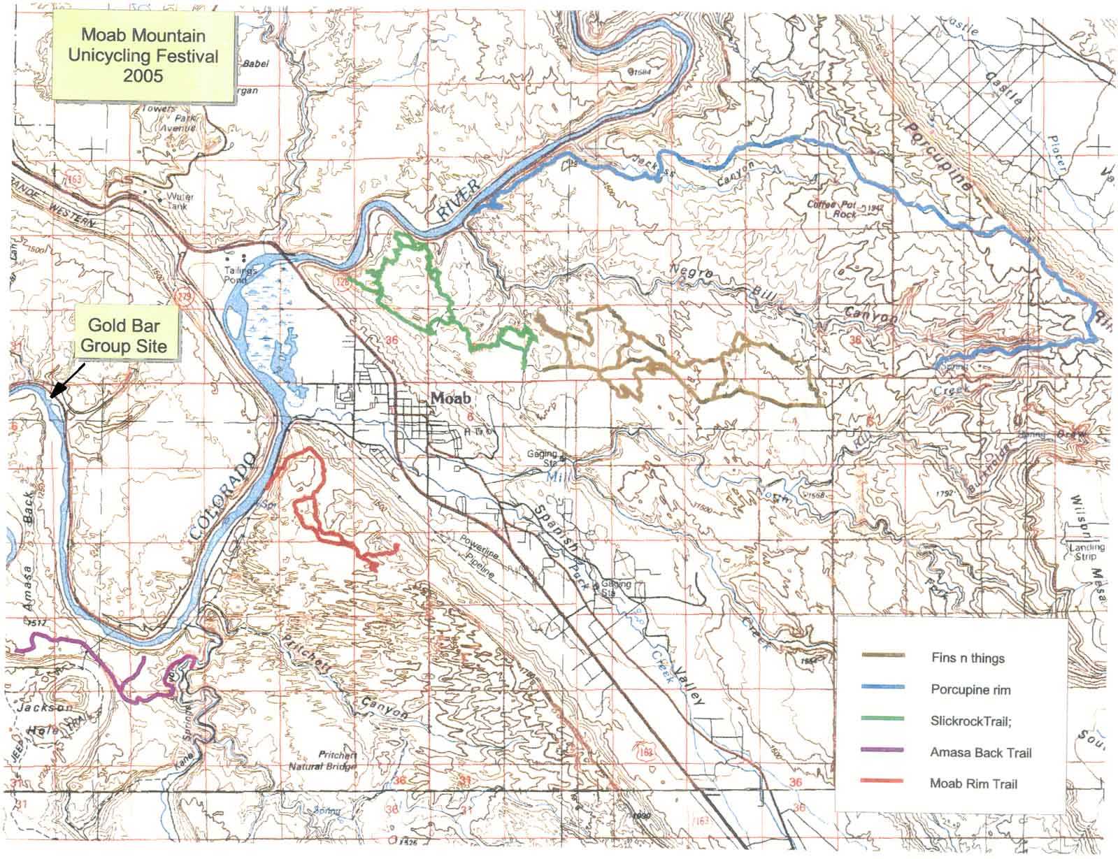 http://www.mappery.com/map-of/Moab-Mountain-Unicycling-Festival-Trail-Map
A topographic map uses contour lines to express elevation and shape of the land. This is a map of trails within Moab, Utah. By showing elevation change one can use this to determine the difficulty of the hike.
Thematic map
http://www.nrcs.usda.gov/Internet/FSE_MEDIA/nrcs142p2_050436.jpg
A thematic map shows information supreme imposed over a base map. It conveys soil moisture regimes of the USA. Dictating the variance by different color.

A thematic map shows information supreme imposed over a base map. It conveys soil moisture regimes of the USA. Dictating the variance by different color.
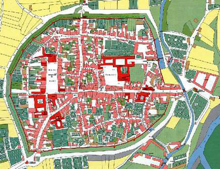
Planimetric map
http://www.eserc.stonybrook.edu/Sayville/images/sayPlanMap.gifA planimetic map is a map that displays no relief like the image above. This image is a map of a town.

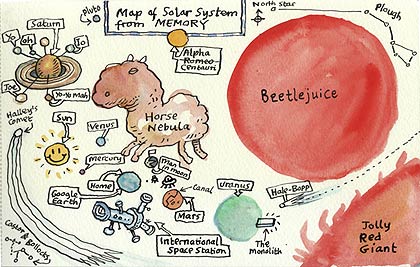
Mental Map
 http://kottke.org/07/02/maps-drawn-from-memory
A mental map is a visual form of a person's knowledge and perception of an area. This map depicts someone's interpretation of space. Mental maps are good maps for associations, as we try to recreate an area in our mind we relate certain things with certain areas. A mental map expresses our thought process and how we correlate certain things.
Subscribe to:
Posts (Atom)